Houston is certainly earning his Candy Canes this year with double duties. So let’s get on with Box 3.
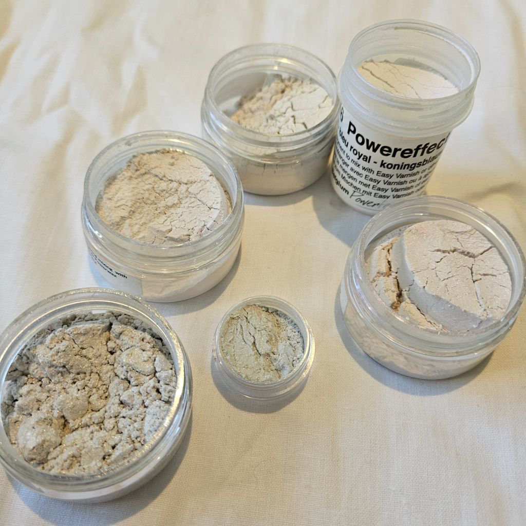
Today we have our first PowerEffect colour, the iridescent/interference range of pigments from Powertex International.
We have PowerEffect Turquoise, a perfect colour for a modern Christmas collection
If you’ve never used the PowerEffect or Secret Art Loft Interference pigments, at first glance they don’t look much, we have interference Red/Blue/Lilac and Silver And PowerEffect Royal Blue in this photo alongside the small pot of Turquoise.
Hint – remember which lid goes on which pot
Interference and iridescent pigments work by having having tiny particles which change the way we see colour, in these cases, it reflects differently on a white or black background.
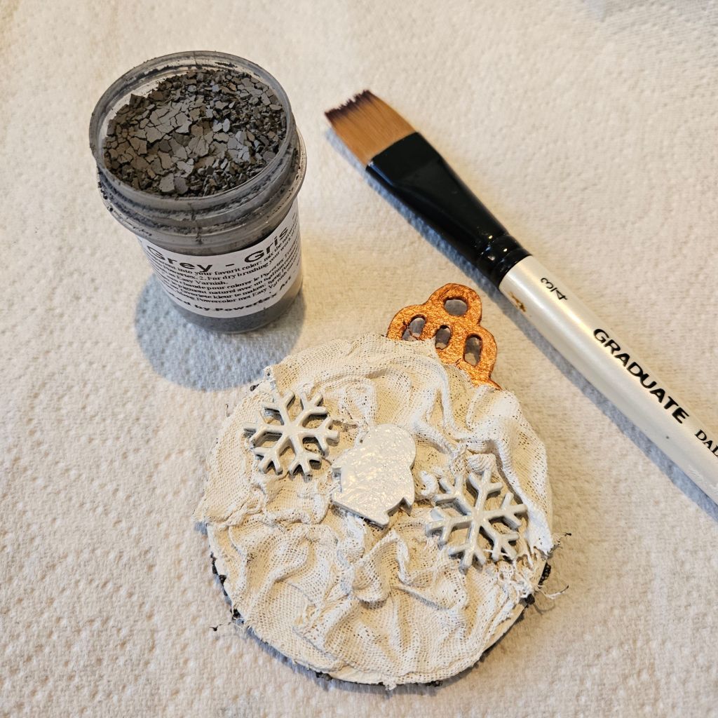
As they don’t show up on light backgrounds, I painted the Ivory side of the Bauble grey as the pigments reflect differently on grey than it does on black.
I did this by painting the Bauble in increasing lighter shades of the grey pigment or you can use lead Powertex.
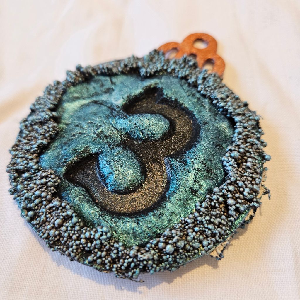
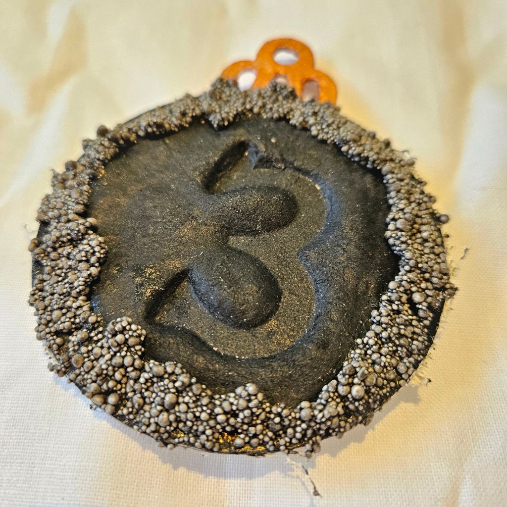
On the blackside, I have a deep rich colour on the Black and where some of the 3D stones are lighter there is natural depth around the edge (I used no white pigment on this side. I used the Santa Boots from yesterday to make the Number 3 pop.
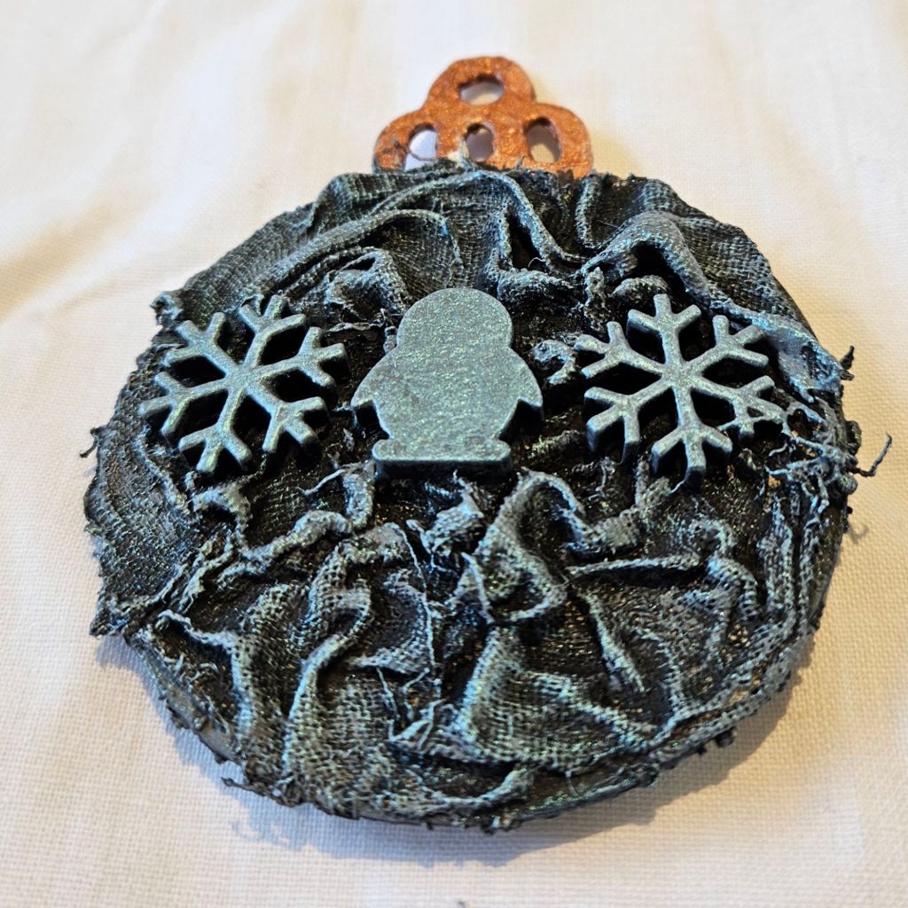
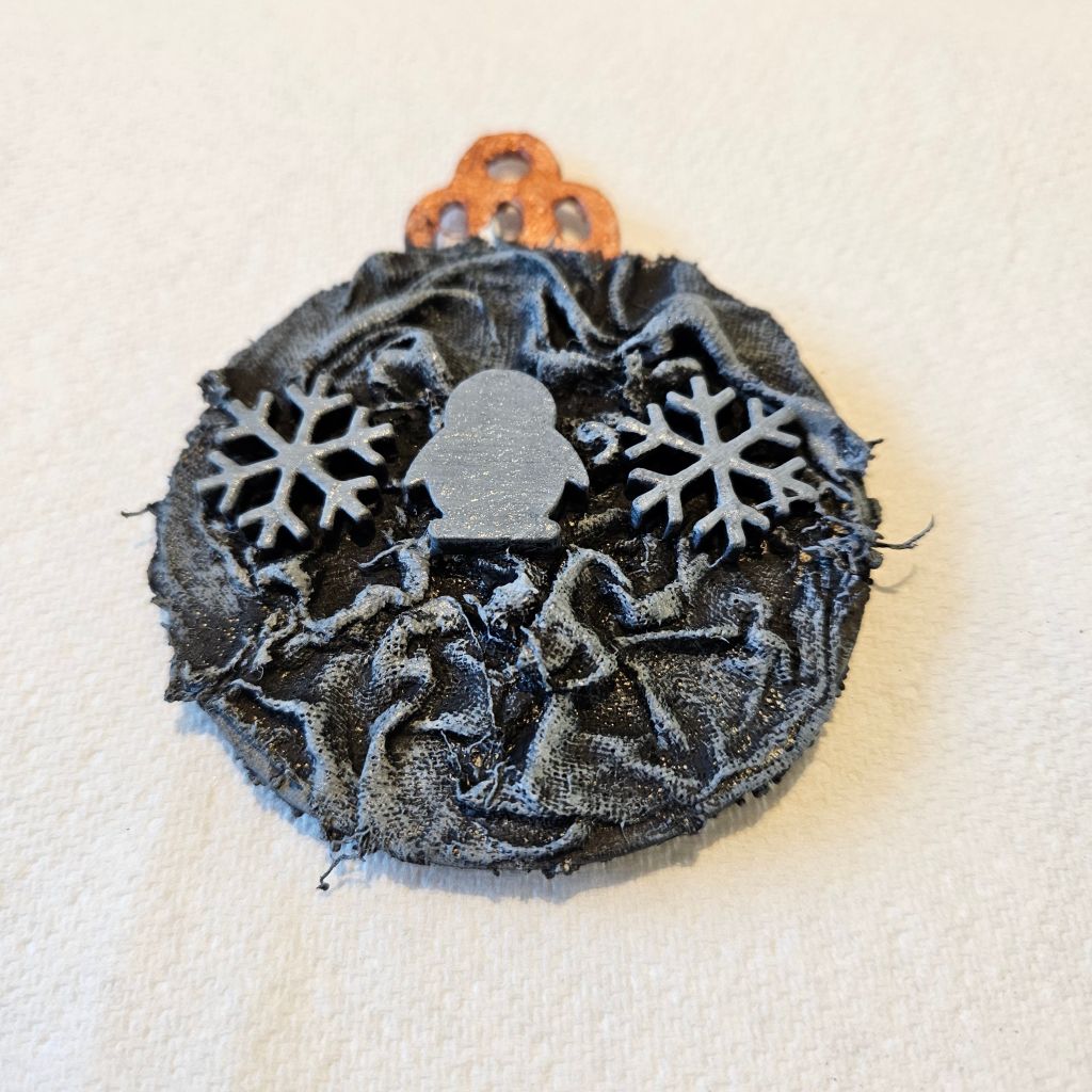
On the grey side, I gently dry brushed just over the top and it gave a much gentler but very metallic colour and the white pigments from the underlying lighter grey areas also shine through.
The PowerEffect Colours are a great way to get a lot of bright shimmer into darker projects and make them stand out.
What do you like about Iridescent Pigments?
Emma W
